Many designers use various techniques for linking images on a website, and making those images change upon hover. From image maps, to slicing each image individually – the page load time and usability of these techniques aren’t as optimal as using CSS image sprites. Here is a quick way to create a functional and user-friendly set of links that load much more quickly!
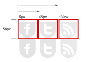
As an example, we will create links and a hover effect for this set of social icons.
![]()
Notice the above is a SINGLE image, rather than three separate images. You may choose to link these at this point, and not have them change when visitors hover. However, good blog and web design principles tell us that it’s always a good idea to have links of any sort change upon hover. This tells your readers that there is something of interest behind the link, and that they should “click” it!
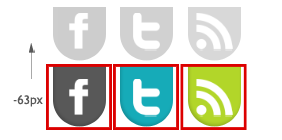
So create your “hover” images and place them under your default images like this. Note that this single image is taking the place of six potential images, thereby reducing server requests and saving bandwidth.
![]()
Here is the code we will use for this effect. (You can see a preview of the result in our header!) Copy and paste this into a helpful visual editor like the one at W3 Schools or Dreamweaver so you can see the results as you make changes.
<!doctype html public "-//W3C//DTD XHTML 1.0 Strict//EN" "http://www.w3.org/TR/xhtml1/DTD/xhtml1-strict.dtd">

<style type="text/css">
#social{position:relative;}
#social li{margin:0;padding:0;list-style:none;position:absolute;top:0;}
#social li, #social a{height:58px;display:block;}

#facebook {left:0px;width:65px;}
#facebook {background:url('YOUR IMAGE URL HERE') 0 0px;}
#facebook a:hover {background: url('YOUR IMAGE URL HERE') 0px -63px;}

#twitter{left:65px;width:65px;}
#twitter{background:url('YOUR IMAGE URL HERE') -65px 0;}
#twitter a:hover{background: url('YOUR IMAGE URL HERE') -65px -63px;}

#rss{left: 130px;width:65px;}
#rss{background:url('YOUR IMAGE URL HERE') -130px 0;}
#rss a:hover{background: url('YOUR IMAGE URL HERE') -130px -63px;}

</style>

<ul id="social">
  <li id="facebook"><a href="YOUR LINK HERE"></a></li>
  <li id="twitter"><a href="YOUR LINK HERE"></a></li>
  <li id="rss"><a href="YOUR LINK HERE"></a></li>
</ul>

</!doctype>
Step 1: Use your own images.
First, replace the image links with your own image URLs. You can use your own server, or a place like Photobucket.com to get image URLs.
Step 2: Size and position your “display windows.”
Change the height in the first section to accommodate your images. Note the values left and width in each section. Change the width in each section to accommodate each individual icon. (Ours are about 58px high and 65px wide.) Then change the left value to move the “windows” from the left side of your document to the right side. Currently, your icons won’t appear properly in these windows until we position them, which is the next step.

Step 3: Position your default images.
We want each default icon to display in each window. Note the values after the first image URL in each section.
#facebook {left:0px;width:65px;}
#facebook {background:url('YOUR IMAGE URL HERE') 0 0px;}
#facebook a:hover {background: url('YOUR IMAGE URL HERE') 0px -63px;}
These two values position the image from the left side of the document and from the top of the document. If the first value is positive, your image will move to the right. If the first value is negative, your image will move to the left. If the second value is positive, the image will move down. If the second value is negative the image will move up.

Step 4: Position your hover images.
Now, use the second value after your image URL to position your hover images into the window. If you placed your hover images below your default images, this value should be negative. You can also use this value to simply position a set of default images to move up or down on hover, without the need for a second set of images to use on hover.

Step 5: Add your URLs and more icons.
At the bottom of the code is a place where you can add your own URLs for your social sites. You can also add as many links as you want. Just remember to duplicate each line item (<li>) for a new link, as well as duplicate a section of CSS and title them all accordingly. For example, to add an e-mail icon to our list, we would add this code just before the </style> tag.
#email{left: 195px;width:65px;}
#email{background:url('YOUR IMAGE URL HERE') -195px 0;}
#email a:hover{background: url('YOUR IMAGE URL HERE') -195px -63px;}
And add this line item before the </ul> tag at the bottom of our code.
<li id="email"><a href="mailto:[email protected]"></a></li>
You’re done! Place the entire code in a widget on your blog!